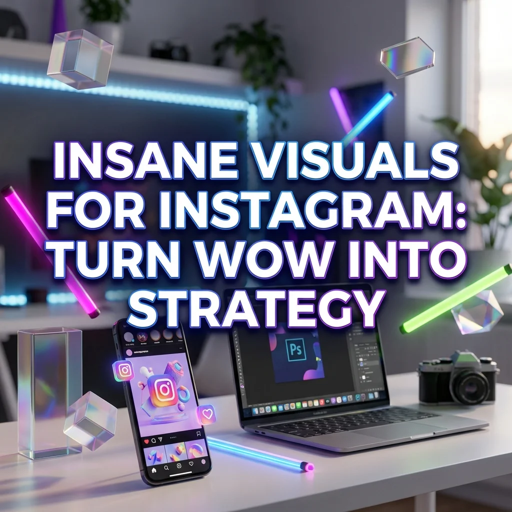
Discover how insane visuals power Instagram strategy with AI-driven content. Learn why bold, legible visuals boost engagement, saves, and shares.
Okay but can we talk about how insane this looks?? 😭 If you spotted this phrase in a caption or a carousel, you know it’s more than hype. It’s a signal. It tells you that visuals aren’t just pretty anymore — they’re performance tools. This article breaks down what that phrase means for Instagram strategy, why insane visuals work, and how to craft AI-driven content that actually stops the scroll. Let’s turn shock into strategy, step by step.

2. What this phrase signals in content strategy
Okay, right away: “okay but can we talk about how insane this looks” is a call to action. It promises a moment of wow, a spark that invites followers to pause, look closer, and engage. For creators, designers, and strategists, that phrase is a shorthand for intent, emotion, and trend alignment. Here’s what it signals in practical terms.
2.1 Audience intent signals
When a caption leans into “insane visuals,” your audience is signaling they want two things: clarity and drama in one package. They crave visuals that feel both design-forward and easy to understand. They want prompts that can be replicated, and results that look distinctive enough to be recognizable in a crowded feed. This isn’t just about being loud; it’s about being legible at a glance. If your audience is mid-funnel — people who want inspiration, prompts, and a repeatable workflow — you’re promising a repeatable system, not just a single wow moment.
2.2 Emotional triggers
Emotions drive shares. The phrase taps into excitement, surprise, and sometimes a touch of memes-era shock. Think of it as a modern version of “you won’t believe this” with a more design-savvy twist. The goal is to trigger a quick, instinctive reaction (laugh, gasp, emoji reaction) and then invite interpretation or a prompt to try themselves. From a psychology angle, this is about dopamine hits delivered through visually bold cues, color, depth, and motion. If your post can capture that spark in the first three seconds, you’ve got a higher likelihood of saving, sharing, and commenting.
2.3 Trend alignment and platform fit
This phrase aligns with what’s trending: rapid-fire visuals, 3D depth, AI-generated aesthetics, and carousel formats that tell a story. Instagram rewards engagement signals like comments and saves, which often come from content that feels “in the moment” and highly rewatchable. Pair audacious visuals with succinct prompts and a clean narrative. That combination fits Instagram’s ecosystem: eye-catching, scroll-stopping, and easy to digest in bite-sized slides. If you want to ride viral waves, make your visuals not just loud, but clear, useful, and repeatable.
3. Benefits of insane visuals for engagement
Insane visuals aren’t vanity; they’re vehicles for clarity and trust. Here’s what you gain when you push visuals into that bold territory.
- Higher stop-rate: People pause the scroll to inspect the detail, which increases dwell time and the odds they’ll read your prompts and tips.
- Stronger memory signals: Distinctive shapes, 3D elements, and motion cues stay in memory longer, making your brand feel familiar and reliable.
- Better shareability: Audiences love teaching others how you did it. A carousel that blends design magic with practical prompts invites resharing and group discussion.
- Clearer positioning: You establish a niche as “the person who shows exactly how to blend AI visuals with practical workflows,” which attracts the right followers and clients.
- Immediate utility: If your visuals come with prompts, workflows, or step-by-step ideas, you deliver tangible value beyond pretty pixels.
Practical tip: pair an obvious wow moment with a simple, repeatable technique. For example, show a dramatic 3D render, then drop a one-line prompt that reproduces a similar effect.
4. How to craft insane AI visuals that fit brand
Creating visuals that feel “insane” and on-brand is about balance. You want edge, but you also want readability and relevance to your niche. Here’s a practical framework you can follow.
4.1 Define your aesthetic baseline
Start with a short style map: color palette, lighting, level of detail, and a signature shape or motif. Think of it as your visual DNA. If your brand uses bold shadows, saturated colors, and slightly exaggerated perspective, write that down. Your prompts can then reference this baseline to stay consistent across posts, reels, and carousels.
4.2 Build a prompt workflow for consistency
Consistency comes from a repeatable process. Create a two-tier workflow: core prompts for core visuals and variant prompts for fresh subthemes. Build a checklist: lighting (soft vs. hard), depth (flat vs. parallax), texture (matte vs. glossy), and motion hints (tiny parallax vs. full motion). A template approach keeps your feed cohesive, even as you push creative boundaries.
4.3 Balance edge with readability
Edgy visuals are exciting, but they must be readable at a thumbnail size. Use high-contrast elements for key information, legible typography, and clear focal points. If a slide becomes too busy, trim something out. Think of your carousel as a conversation: every slide should carry a single, digestible idea.
4.4 Use depth, 3D, and motion effects
Depth and 3D give your visuals that “insane” pop. Layer foreground, midground, and background elements to create a sense of space. Subtle motion (parallax, micro-interactions, or slow rotations) can retain attention without overwhelming the message. These effects should support your message, not distract from it.
4.5 Carousel-ready design principles
Carousels demand scannable information. Use a consistent layout: a bold headline per slide, a single supporting image, and a short caption with a practical tip. Keep navigation arrows or slide indicators clean but visible. Use a mix of stills and stylized composites to demonstrate prompts, but ensure every slide either teaches or invites action.
5. Carousel storytelling and flow
Story flow matters as much as the visuals themselves. A well-structured carousel guides a viewer through intrigue, understanding, and action.
5.1 Hook-first design for each slide
Each slide should begin with a hook: a bold claim, a surprising stat, or a vivid visual that begs “how did you do that?” Keep hooks concise, ideally under 10 words, and pair them with a strong image that reinforces the message.
5.2 Clear narrative arc per carousel
Treat each carousel as a mini-story: setup, reveal, and takeaway. The first slide sets the stage; the middle slides expand on the idea with prompts, examples, or mini-tutorials; the final slide delivers the takeaway and your call to action.
5.3 Transitions and micro-interactions
Smooth transitions keep viewers moving. Use consistent typography, a unifying color accent, and micro-interactions (hover-like cues in static slides or subtle motion) to connect slides. These micro-ticks of motion feel like tiny “aha” moments between frames.
5.4 CTA and engagement prompts
End with a concrete action: save for later, try the prompts, share with a friend, or comment “NEED MORE” for more prompt drops. A strong CTA turns passive viewers into active participants.
6. Workflow optimization for teams
Big visuals often require collaboration. A structured workflow speeds up production while keeping quality high.
6.1 Asset library and versioning
Create a centralized asset library with folders for prompts, outputs, and approved variations. Version all assets with clear naming (base-aesthetic_v1, promptset_A_v2). It saves time during reviews and reduces misfires on brand alignment.
6.2 Collaboration and review workflow
Set a simple review loop: creator drafts, designer refines visuals, strategist checks alignment, then approve. Use comments to keep feedback focused and track decisions. Schedule quick review sprints to avoid bottlenecks.
6.3 Batch creation and speed tips
Batch similar tasks: write prompts in blocks, render several variations at once, then pick winners. Use templates for recurring layouts; automate repetitive steps where possible. Time-box each stage to keep momentum.
7. Analytics and iteration plan
Track what works and iterate quickly. Data informs creative decisions and helps you scale your success.
7.1 Key metrics to track
- Stop rate and dwell time: how long viewers stay on each slide.
- Saves and shares: indicators of content value and usefulness.
- Comment sentiment: shows whether reactions are positive, curious, or critical.
- Click-throughs on prompts: measure how many followers try your prompts.
- Follower growth correlation: link spikes to specific carousels or prompts.
7.2 A/B testing prompts and visuals
Test two visuals with the same message but different styles, lighting, or depth. Compare engagement and retention. Rotate winners into your regular cadence to build a recognizable style with proven performance.
7.3 Iteration loop for prompts
Keep a living prompt library. After each campaign, extract what worked (words, tone, formatting) and update your templates. A small tweak now saves a lot of trial-and-error later.
8. Tools, resources, templates
- Prompt libraries: collect core prompts, variants, and brand-aligned language.
- 3D assets and lighting guides: ready-made textures and lighting setups to speed up production.
- Carousel templates: slide grids, typography scales, and caption hooks that translate across topics.
- Collaboration tools: project boards and review checklists to streamline feedback.
- Rights and ethics checklists: ensure compliant use of AI-generated visuals and stock elements.
Key takeaways
- The phrase okay but can we talk about how insane this looks signals a shift toward content that blends wow with wisdom. Insane visuals capture attention, but they must also educate and provide practical value.
- Build a repeatable workflow so your audience can replicate your results. Consistency breeds trust and growth.
- Carousels thrive on clear narrative, tight hooks, and smooth transitions. Use depth, 3D, and motion to create excitement without sacrificing readability.
- Invest in a shared asset library, a simple review loop, and batch production to scale your creative output.
- Measure what matters: stop rate, saves, comments, and prompt usage. Iterate quickly based on data.
CTA
If you’re ready to level up your Instagram strategy with repeatable AI-driven visuals, save this guide, try one prompt from the example templates, and share your results in the comments. Want more prompt drops and a ready-to-paste workflow? DM me with “NEED MORE” and I’ll send you a starter kit.